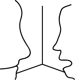
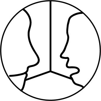
I’ve designed a new logo to better go with the flat design I intend to use. I have’t chosen the colours yet but they will be synonymous with the rest of the website, each section will be coloured slightly differently.
I wanted to create an optical illusion with negative space, however I’ve been looking at other logos and I think the most well designed ones are self contained inside some kind of border. I’d guess that is so the logo can stand out and not interfer with whatever page its put on.

